Holographic Beer Label Paper in 2026: The Designer's Technical Guide to Rainbow Effect Substrates for Premium Craft Packaging

Published: May 2026 | 12 min read | Audience: Brand Packaging Designers & Creative Directors
There is a moment every packaging designer knows. You are standing in the aisle of a well-stocked bottle shop, not as a consumer but as a professional, and something on the shelf stops you cold. Not because the typography is clever or the illustration is beautiful — you have seen plenty of those — but because the label is moving. The colors shift as the bottle tilts. Blue bleeds into green, green into gold, gold back into violet. The person next to you picks it up before they have read a single word.
That is what holographic substrate does that no amount of clever print design on flat silver metallized paper can replicate. It is not a special effect you add to a label. It is the label itself doing the work.
But here is where most conversations between designers and substrate suppliers break down: the design team asks for "a holographic effect" and the supplier sends a sample. It looks stunning in a static photograph. It looks acceptable under a photo studio ring light. Then the production run comes back and the rainbow shift is muted, inconsistent across the web width, or — worst of all — completely masked by the overprint ink coverage the brand artwork requires. The brief that started with "we want something that moves on the shelf" ends with a label that looks like slightly unusual silver foil.
This guide exists to close that gap. It explains how holographic beer label paper actually works at the optical physics level, what the real variables are that determine whether your finished label dazzles or disappoints, and what production parameters your label converter needs to manage to deliver the effect your design brief demands at scale.
📑 Designer's Technical Guide — Contents
How Holographic Effect Actually Works: Diffraction, Not Pigment
The Four Main Holographic Pattern Types and When to Use Each
The Print Coverage Problem: Why Your Artwork Can Kill the Effect
Production Consistency at Scale: The Variables That Matter for High-Speed Runs
Holographic Paper vs. Holographic Foil Label: Making the Right Substrate Choice
Practical Design Guidelines for Maximising Holographic Impact on Beer Labels
1. How Holographic Effect Actually Works: Diffraction, Not Pigment
The single most important thing a packaging designer can understand about holographic substrate is this: the rainbow effect has nothing to do with color pigments, inks, or dyes. It is a purely physical optical phenomenon called diffraction — and understanding that distinction changes everything about how you design for it.
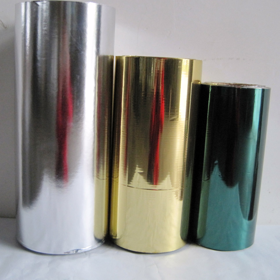
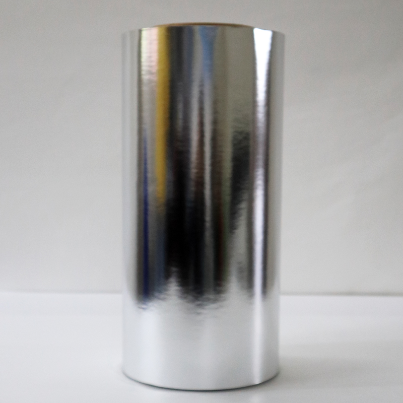
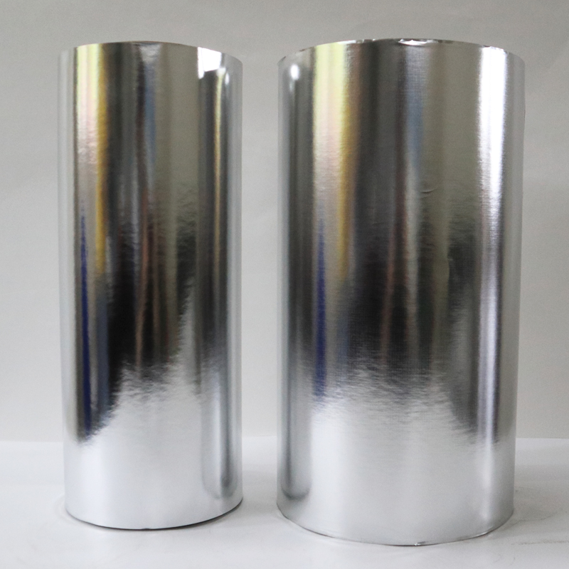
Standard silver metallized paper reflects light the way a mirror does: at the same angle as the incident light, producing a flat, uniform metallic brightness. The color you see doesn't change as the viewing angle changes because there is no mechanism to separate the white light into its component wavelengths.
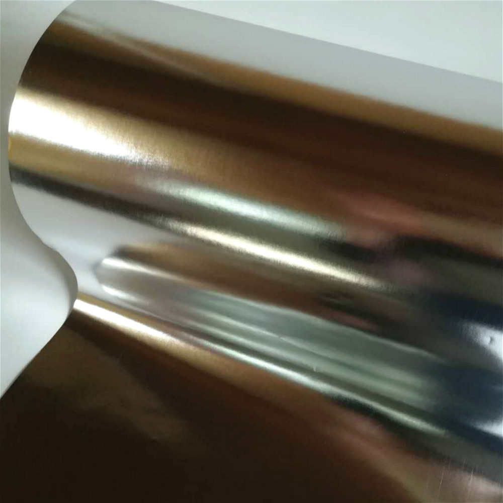
Holographic substrate works entirely differently. During manufacturing, an embossed diffraction grating — a microscopic pattern of parallel ridges and grooves at nanometer-scale spacing, typically 500 to 3,000 lines per millimeter — is physically impressed into the aluminum surface layer through a process called embossing, using a metal shim or nickel master that carries the pattern. When white light strikes this micro-structured surface, each wavelength (each color in the visible spectrum) is reflected at a slightly different angle, determined by the grating equation:
mλ = d(sin θᵢ + sin θᵣ)
Where m is the diffraction order, λ is the wavelength of light, d is the grating spacing, and θᵢ and θᵣ are the angles of incidence and reflection. In plain terms: blue light bounces in one direction, red in another, green in another still. As the bottle — or the viewer's eye — moves, different wavelengths come into alignment with the viewing angle, and the surface appears to shift color continuously through the spectrum.
This is why a well-specified holographic beer label under retail shelf lighting or in direct sunlight can stop a shopper in their tracks in a way that no printed color effect can match. The visual stimulus is physically real, not a print simulation of depth or shimmer.
2. The Four Main Holographic Pattern Types and When to Use Each
Not all holographic substrates produce the same visual effect. The diffraction grating pattern embossed into the aluminum surface determines the specific color movement, angular range, and visual "character" of the finished label. As a designer briefing a substrate supplier, specifying the pattern type is as important as specifying the base paper grammage or coating weight.
Pattern Type 1: Rainbow Linear (Standard Holographic)
The most widely available and lowest-cost holographic pattern. The diffraction grating runs in a single orientation, producing a bold, wide-spectrum rainbow sweep across the label surface as the viewing angle shifts. The color movement is dramatic and easy to see under most retail lighting conditions. Best suited to: bold, simple label graphics where maximum visual impact is the primary objective. Works well with minimal overprint ink coverage.
Pattern Type 2: Starburst / Radial
The grating lines radiate outward from a central point, creating a star-like or sunburst diffraction pattern. The rainbow effect rotates around the central point as the viewing angle changes, giving the label a distinctly dynamic, "alive" quality. Particularly effective for circular label formats or label designs with a strong central focal element. More visually complex than linear rainbow and commands a higher perceived premium value.
Pattern Type 3: Micro-Pattern / Fine Grain
Instead of large sweeping rainbow bands, the grating is composed of extremely fine, randomly-oriented microscopic cells. The result is an overall iridescent sparkle — an even, shimmering surface that shifts between silver and subtle color tones without pronounced directional color banding. This is the iridescent label paper effect. Best suited to: sophisticated, understated premium positioning where designers want a "quiet luxury" metallic effect rather than overt rainbow drama. Common in wine crossover beers, barrel-aged stouts, and high-end craft lager.
Pattern Type 4: Custom Embossed / 2D-3D Holographic
The most technically complex and highest-cost category. Custom patterns — brand logos, geometric motifs, text elements — are directly embossed as the holographic grating structure itself, so the diffractive effect reveals a specific visual element rather than an abstract rainbow. The holographic pattern is the design element. MOQ requirements for custom embossing are significantly higher due to master tooling cost, and lead times extend to 4–6 weeks for the master shim production. Best suited to: flagship products and limited editions where the label is intended to function as a brand authentication device as well as a visual element.
3. The Print Coverage Problem: Why Your Artwork Can Kill the Effect
This is the section most substrate suppliers do not explain clearly enough, and it is the single most common source of disappointment in holographic beer label projects. The principle is simple and merciless: wherever opaque ink covers the holographic surface, the diffraction effect is eliminated at that point. The grating is still physically present beneath the ink film, but the light never reaches it.
The implication for designers is direct: the holographic substrate only delivers visual impact in the areas of the label that remain free of opaque ink coverage. Designs with high ink coverage across the entire label surface — complex full-bleed illustrations, solid color backgrounds, heavy dark typography filling the label face — can reduce the visible holographic area to a narrow band of exposed metallic surface around the edges of the artwork. The effect that sold the client in the sample presentation is buried under the artwork.
The Ink Coverage Rule of Thumb
For holographic substrate to deliver meaningful visual differentiation on a beer label, designers should aim to keep the total ink coverage across the label face to a maximum of 40–50% of the total label area. This is a creative constraint, not a printing limitation — and the best holographic beer label designs treat it as a structural design principle rather than a restriction.
The most effective holographic beer label designs deliberately expose large areas of the substrate surface. Reversed-out (white-on-metal or color-on-metal) typography, spot-print brand marks floating on an open metallic field, or graphic elements that frame rather than fill the label face — all of these approaches maximize the holographic substrate's contribution to the finished label's visual character.
Transparent and Translucent Inks: A Different Calculus
There is a partial solution to the coverage constraint: transparent and semi-transparent inks. When a transparent ink is printed over the holographic surface, it tints the diffraction effect rather than blocking it. A transparent cerulean blue printed over a rainbow linear holographic substrate does not produce a flat blue surface — it produces a blue-shifted rainbow, where the full spectrum color shift of the substrate is visible but cast through a blue tonal filter. This technique — printing with transparent ink systems deliberately formulated for use over holographic and metallized substrates — opens up a significantly wider design space than opaque ink coverage allows, and produces genuinely distinctive visual results that are impossible to achieve with conventional print processes.
📖 Understanding the base substrate before specifying holographic effects: What Is Metallized Paper? A Craft Brewer's Guide to Beer Label Substrates
4. Production Consistency at Scale: The Variables That Matter for High-Speed Runs
A holographic beer label that looks spectacular on a hand-pulled press proof but fails to hold consistent color shift across a 50,000-label production run is commercially worthless. For a brand packaging designer, understanding the production variables that govern holographic effect consistency is the difference between briefing a supplier with confidence and discovering the problem at the quality inspection stage.
Variable 1: Embossing Pressure Uniformity Across the Web Width
The depth and uniformity of the diffraction grating embossed into the aluminum layer is the single most critical determinant of holographic effect consistency. If embossing pressure is uneven across the web width — higher at one edge, lower in the center, or varying in the machine direction — the grating depth varies, and the color shift intensity varies with it. The left side of the label looks like a premium holographic substrate. The right side looks like aged silver foil.
At Huafu Pack, our holographic embossing process runs constant pressure monitoring across the full 1,300mm web width. Roll-to-roll uniformity is verified at the start and end of each production batch. For buyers requesting consistent premium holographic effect at volume, ask your supplier to specify the embossing pressure tolerance across the web and request a cross-web sample — not just a single strip — from the production batch you will be converting.
Variable 2: Nickel Master Shim Lifespan and Replacement Schedule
The master shim — the engraved metal tool that carries the diffraction grating pattern and physically embosses it into the aluminum layer — wears over its operational life. As the shim wears, grating definition degrades gradually. The holographic effect on labels produced from a worn shim is noticeably less vivid than on labels produced at the start of the shim's life. For a supplier running high volumes, this is a managed maintenance issue. For a buyer who receives labels from three consecutive production runs spanning 18 months, it can look like progressive quality degradation from an otherwise unchanged substrate specification.
Variable 3: Aluminum Layer Optical Density Consistency
The holographic diffraction effect depends on the aluminum layer acting as a high-reflectivity mirror beneath the embossed grating. If aluminum layer thickness varies — producing optical density fluctuations below OD 2.6 in any section of the roll — reflectivity drops and the holographic color shift loses its vividness. The grating is still present but it has nothing bright enough to reflect from. Specify minimum OD ≥ 2.8 consistently across the full roll for holographic beer label applications and request batch COA confirmation.
Variable 4: Corona Treatment Compatibility with Holographic Top Coating
Holographic paper carries a specialist top coating over the embossed aluminum surface — one formulated to protect the micro-grating structure from abrasion and to present a printable surface for subsequent label converting. This top coating interacts with corona treatment differently than the standard metallized paper top coating described in our UV flexo and gravure printing guide. Surface tension requirements are identical (minimum 38 dyne/cm for reliable ink adhesion) but the corona power setting may need adjustment to avoid over-treating the finer-structured holographic surface. Request the supplier's recommended corona treatment parameters alongside the standard technical data sheet.
5. Holographic Paper vs. Holographic Foil Label: Making the Right Substrate Choice
For premium craft beer brands, the substrate decision typically comes down to two options once the holographic direction is agreed: paper-based holographic substrate or holographic foil laminate. They are not interchangeable, and the wrong choice for a specific application creates production complications and sustainability questions that are expensive to reverse mid-program.
| Decision Factor | Holographic Metallized Paper | Holographic Foil Laminate Label |
|---|---|---|
| Holographic Effect Intensity | High — direct embossing on aluminum layer. OD ≥ 2.8 delivers vivid color shift. | Very high — thicker foil base allows deeper grating embossing. More pronounced 3D effect possible. |
| Unit Cost | Lower — paper substrate costs significantly less than solid foil sheet per m². | Higher — solid foil material cost premium plus lamination process adds cost. |
| Convertibility on Press | Runs on standard flexo/offset presses. No equipment modification. | Requires tension control adjustment. Some presses need web guide modification. |
| Recyclability (EU PPWR 2026) | Paper-dominant fiber structure. Better recyclability profile. Favourable EPR fee modulation. | Multi-layer composite (foil + adhesive + possible plastic carrier). Challenging recyclability profile. |
| Ice Bucket Wet Performance | Excellent with wet-strength treatment. Label stays intact and holographic effect unaffected. | Excellent. Foil is inherently moisture-resistant. |
| Tactile Feel on Bottle | Natural paper flex — softer, lighter feel in the hand. | Rigid, crisp foil feel — signals premium to touch as well as visually. |
| Minimum Order Quantity | Lower MOQ accessible — from 2 tons for standard holographic patterns. | Higher MOQ — lamination process economics favor larger runs. |
| Best Suited For | Craft and premium craft beer brands. High-volume label programs. Sustainability-conscious brands. | Ultra-premium limited editions. Brands where tactile premium feel is as important as visual effect. |
📖 Navigating recyclability and EU compliance for your label substrate choice: Sustainable Beer Label Paper in 2026: How to Stay PPWR-Compliant Without Losing Your Metallic Shelf Impact
6. Practical Design Guidelines for Maximising Holographic Impact on Beer Labels
These are not aesthetic opinions. They are production-tested design principles derived from the physics of diffraction and the realities of label press behavior on holographic substrate. Apply them in your initial brief and you will spend far less time managing client disappointment during the proofing stage.
Guideline 1: Design Backwards from the Exposed Substrate Area
Before placing a single typographic or illustrative element, map the label face and identify which zones will carry opaque ink coverage. These are the areas where the holographic substrate will be invisible. Then design positively into the remaining exposed areas — they are your primary visual real estate. Many of the strongest holographic beer label designs treat the metallic substrate as the background color and build minimalist graphic systems on top of it, rather than designing a complete label and hoping some holographic shimmer shows through at the edges.
Guideline 2: Use the Label Shape as Part of the Effect
Die-cut label shapes — asymmetric cutouts, shield forms, elongated ovals — expose the bottle glass or beer color at the label edges, creating a contrast against the holographic field that amplifies the visual movement effect. A holographic rainbow substrate applied to a standard rectangular front panel reads as a substrate. The same substrate on a bold custom die-cut shape reads as an intentional, designed experience.
Guideline 3: Reserve White and Light Colors for Typography Only
Opaque white is the most coverage-efficient color in label printing and the fastest way to obliterate a holographic substrate. Reserve white ink for essential legibility — ABV, volume, regulatory text, maximum critical brand typography — and route it as fine reversed-out strokes or small point-size text rather than filled white panels. The brand name and key descriptor should ideally be executed in reversed-out (substrate-reveal) form wherever legibility requirements allow.
Guideline 4: Specify Ink Opacity Deliberately in Your Print Brief
When briefing your label converter, specify ink opacity as a production parameter — not just as an implicit assumption. Ask for a press proof with a measured 40% average total area coverage and review it under the actual retail lighting conditions your primary channel uses, not under press-room fluorescent lighting. The holographic effect reads very differently under directional spot lighting (bottle shop shelf) versus diffuse overhead lighting (supermarket aisle).
Guideline 5: Test the Motion Before You Sign Off the Proof
Holographic label approval should never happen from a static printed proof held flat on a table. Hold the proof at arm's length and tilt it through a 45° arc under a single directional light. If the color movement is clear, vivid, and consistent across the full label face, the substrate is performing correctly. If color movement is only visible at extreme tilt angles or is uneven across the web width, there is either a substrate quality issue or an ink coverage problem to resolve before production approval.
7. FAQ: Designer Questions, Production-Level Answers
A: It depends entirely on the opacity of the spot color formulation. Standard opaque Pantone inks will block the holographic effect wherever they cover the surface. However, many ink manufacturers offer transparent or semi-transparent versions of Pantone-matched colors specifically formulated for metallized and holographic substrate applications. These transmit the diffraction effect through the ink film, producing a color-tinted holographic appearance rather than a flat spot color. Ask your ink supplier specifically for their transparent metallized-substrate range and run adhesion and coverage tests on your holographic substrate before approving for production. The results can be genuinely spectacular — and they look nothing like what you can achieve on any conventional substrate.
A: For standard holographic patterns (rainbow linear, starburst, fine grain) from Huafu Pack, the minimum trial order is 2 tons per specific width and pattern specification. This is sufficient for approximately 800,000 to 1,200,000 standard beer front labels at 80–100 gsm base paper weight, depending on label size and roll conversion waste. For custom embossed patterns (custom logo holographic), a master shim tooling investment is required and MOQ is higher — contact our sales team directly for custom pattern project scoping, as this varies by pattern complexity and shim specification.
A: Yes — with the correct substrate specification. The diffraction grating is physically embossed into the aluminum layer and protected by the top coating. It is not a surface-applied optical film that can delaminate or fog in wet conditions. When the base paper carries appropriate wet-strength resin treatment (Cobb60 ≤25 g/m²) and the label is applied with a compatible wet-glue or pressure-sensitive adhesive system, the holographic effect remains fully visible and vivid on a wet bottle surface. The water film on the bottle glass does not interfere with the label's optical performance. This is one of the genuine practical advantages of embossed holographic over printed interference coatings, which can haze or cloud when wet.
A: Request the holographic pattern sample set from our export team — Susan, Vivian, or Janet can send physical samples of our current standard pattern range (rainbow linear, starburst radial, fine grain micro-pattern) alongside the base paper specification options. Once you have identified the pattern type that matches your brand visual brief, reference it by the pattern code on the sample card in your purchase specification. Include the required OD value (minimum 2.8), base paper grammage (GSM), roll width, and core diameter alongside the pattern specification. For new OEM clients, we recommend running a free A4 sample approval with your label converter before the first production order — this eliminates any print process surprises before you are committed to a full roll quantity.
Your Next Beer Label Needs to Move. Let's Make That Happen.
Request Huafu Pack's full holographic pattern sample set — rainbow linear, starburst, fine grain iridescent, and custom emboss options. Our export team (Susan, Vivian, and Janet) can advise on pattern selection, base paper specification, and print process compatibility for your specific press setup and artwork direction.
📍 Xianning High-Tech Zone, Hubei Province, China | ✉️ sales@huafupacking.net | 📞 +86-13797805927
Mr. Xiao leads special effects substrate development at Huafu Packing Material Co.,Ltd, Xianning. Over the past decade he has worked with brand packaging designers and creative directors across Europe, North America, and the Asia-Pacific region, translating design briefs for holographic and special effect beer labels into achievable production specifications. He writes for designers who need to understand the physics well enough to brief the factory correctly — not to become optical engineers, but to stop being surprised by what comes back from the press.
Technical References & Industry Standards
Born, M. & Wolf, E. — Principles of Optics (7th Edition, Cambridge University Press): Chapter 8, Diffraction Gratings — Grating equation derivation and angular dispersion of diffracted orders.
FINAT Technical Handbook (9th Edition) — Section 9: Special Effect Label Materials, holographic and iridescent substrate performance standards for label converting applications.
TLMI (Tag and Label Manufacturers Institute) — Special Effects Substrates Technical Resource Guide, 2024: Holographic paper embossing consistency requirements and converter best practices.
Huafu Packing Material Co.,Ltd — Holographic Pattern Production Specifications & Cross-Web Uniformity QC Records, Xianning Facility, 2011–2026.
ISO 8296:2003 — Surface tension measurement method applied to holographic top-coat surface qualification for label printing applications.
ASTM D3359-22 — Tape adhesion test method applied to overprinted holographic label stock qualification protocol, Method B cross-hatch assessment.